
What I Learned Redesigning My Own Website
Designing for yourself is 10x harder than designing for clients. Here’s why—and what I learned in the process.
Why Redesign at All?
Full transparency: I don’t like doing just one thing. I’m an actor, writer, director, web designer, content strategist—and a capable barista. Before working as Director of Marketing at Valdemar Estates, I spent years in hospitality to support my creative passions.
My résumé is eclectic, and I’ve come to see that as a strength. But when I decided to turn my side hustle (web design) into a full-time business, I realized my website needed to tell a much more focused story.
Starting from Scratch
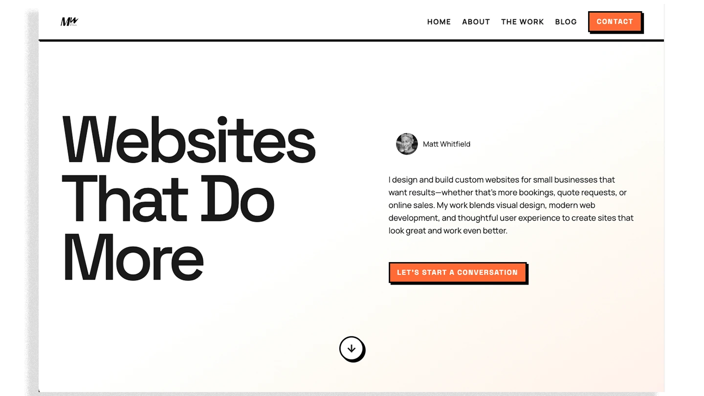
My old website was hard-coded and geared toward roles in customer success, product management, and UX. While those skills still inform my work, the site no longer supported my current goals: attracting small business clients, showcasing portfolio work, and offering clear calls to action.
Instead of trying to retrofit a site built for job applications, I chose to start fresh—to design a website that served my needs as a business owner and partner.
The Paradox of Choice
Few things are more paralyzing for creatives than the blank page. Every decision opened a thousand possibilities: Should I build from scratch? Use a Framer template? Go fully custom? Designing for myself—wearing both the client and designer hats—was exponentially harder than working with a real client.
My North Star
My goal was simple: Build a site that reflects how I collaborate with organizations—not just to design a site, but to support their long-term marketing goals. I needed a platform that told that story clearly.
While I could have used WordPress or Squarespace, my ability to code and work with modern frameworks is part of my value proposition. So I chose a framework that would demonstrate those skills.
Without getting too deep into the technical weeds, Astro offered the perfect balance of custom code, performance, and scalability. It’s fast, easy to manage, and framework-agnostic—making it an ideal choice for building a fast, flexible site that reflects what I can offer clients.
Many businesses are now turning to modern frameworks like Astro and Next.js for performance-driven e-commerce and marketing sites. If you’re curious about JAMStack frameworks and what they mean for your business, I wrote a deeper dive here.
Understanding modern web technologies doesn’t just help with coding—it makes working with no-code platforms like Webflow or Framer smoother and more strategic. It’s part of what makes a designer truly flexible and future-ready.
What to Build
I’ve learned the how matters less than the what. Instead of jumping into visuals, I asked: What problem does my website need to solve—for me, and for visitors?
That question led me to outline content first, map user journeys, and define my value proposition before opening Figma. I even wrote a product requirements document (PRD)—something I’ve done for clients, but never for myself. It was liberating.
Lesson learned: strategy beats aesthetics every time.
The Design Process

Early wireframes were mid-fidelity, emphasizing simple branding and visual design decisions. This made it easy to streamline the development process by leveraging modern AI coding techniques to achieve pixel-perfect design without the need to overthink high-fidelity mockups and prototypes.
Once I had the content and tech stack nailed down, I made a deliberate decision not to over-design. I’ve built pixel-perfect prototypes in Figma before, but for this project, I intentionally kept things loose.
Why? Because overthinking every visual detail leads to paralysis. I’m not a visual designer by trade—I’m a systems thinker. I care about function and clarity.
So I made a few early decisions around brand—color, font, visual tone—then created a handful of low-fidelity wireframes. After selecting the strongest direction, I moved quickly into development, using a neo-brutalist style with card-based layouts and plenty of breathing room.
Enter Vibe Coding
One of the most exciting parts of this project was experimenting with vibe coding.
“Vibe coding is an approach to software development where a person describes a problem in a few sentences to a large language model, which generates working code based on the description.”
Coined in early 2025, the concept is already reshaping how beginner and intermediate developers build software. For me, it was a game-changer.
I’ll write more about vibe coding soon, but here’s the short version: it helped me build a fully custom site with a clean design system, intuitive UX, and code that I can easily manage and scale.
It’s not a silver bullet—you still need technical understanding to guide and refine what the AI generates—but it dramatically speeds up development. Most importantly, it freed me up to focus on function over form.
How This Changed My Client Work
Redesigning my website forced me to practice what I preach:
- Empathize with the user.
- Define the right problem before proposing solutions.
- Prioritize speed and iteration over perfection.
I now apply these same principles to client projects, with better results:
- Faster turnarounds using vibe coding and modular frameworks.
- Clearer messaging grounded in user needs.
- Designs focused on conversions—not just aesthetics.
The process made me more outcome-driven. I’m less focused on showcasing my skills, and more focused on how I solve your problems.
Key Takeaways for Designers
- Stop striving for pixel-perfect mockups—test, launch, refine.
- Learn how code works, even if you’re not a developer. Tools like vibe coding can demystify the process and reveal why devs push back on design decisions.
- Focus on UX fundamentals: user flows, storyboards, journeys. Wireframe quickly. Iterate intentionally.
Key Takeaways for Clients
- Your website should serve your business goals—not your designer’s ego.
- Before hiring a designer, define what you want your website to do. That clarity will save you time, money, and headaches down the road.
Final Thoughts
Redesigning my site was a humbling experience—and it made me better at my job. I trusted the product development and UX processes I use for clients, and the results speak for themselves.
My site is faster, clearer, more focused. It tells a story. It drives action. Most importantly, it serves the purpose I designed it for.